
Case Study
Due to their geographical proximity and complementary services and resources, the ports of Lisbon and Setúbal are united in the mission of strengthening Portugal's position on the international maritime map. This mission requires both Ports to appear and communicate together on many occasions.
To enhance this entire strategy, it was necessary to analyze the identity and brand statement of each Port and prepare them for the demands of coexistence while simultaneously strengthening the individual identity of each. This moment occurred at the beginning of 2024, and Shift was the agency responsible for the project.
Ports as gateways to the Atlantic
Portugal is a maritime country. A nation of the sea. An oceanic country with a coastline of about 2,500 km and a highly privileged geographical position. Beyond being one of the strongest symbols of the nation-brand, the sea is a fundamental asset for the economic and social development of our country. It is in this context that port activity assumes special strategic relevance.
As reference ports in the Atlantic, Lisbon and Setúbal are logistical platforms that place Portugal at the center of the main international trade routes, as well as a gateway for thousands of tourists arriving on cruises each year.
Driven by a strong commitment to innovation and environmentally responsible practices, these Ports operate with a clear commitment to sustainability and modernization.

Creating unity through branding
The path was identified – creating a cohesive and functional brand architecture solution that highlighted the unique characteristics of the Lisbon and Setúbal ports, strengthening both their individual and collective image.
This necessarily had to be accompanied by a robust communication framework capable of projecting the scale of both Ports.

Rebranding in two stages
The old Setúbal Port brand was outdated because it represented a project that had evolved significantly, now strongly focused on innovation and sustainability, and because, from an aesthetic point of view, it was very dated. This brand was completely rebuilt from scratch.
The Lisbon Port brand was approached more surgically because it still manages, on many levels, to keep up with the evolution of the project it represents and remain aesthetically updated.
This two-stage rebranding had to:
— Reflect the complementarity from a strategic and business perspective.
— Enable a balanced coexistence of the two brands.
— Place the two Ports on the same level and, when necessary, project a strong and unified image.
— Amplify the impact of joint public appearances.

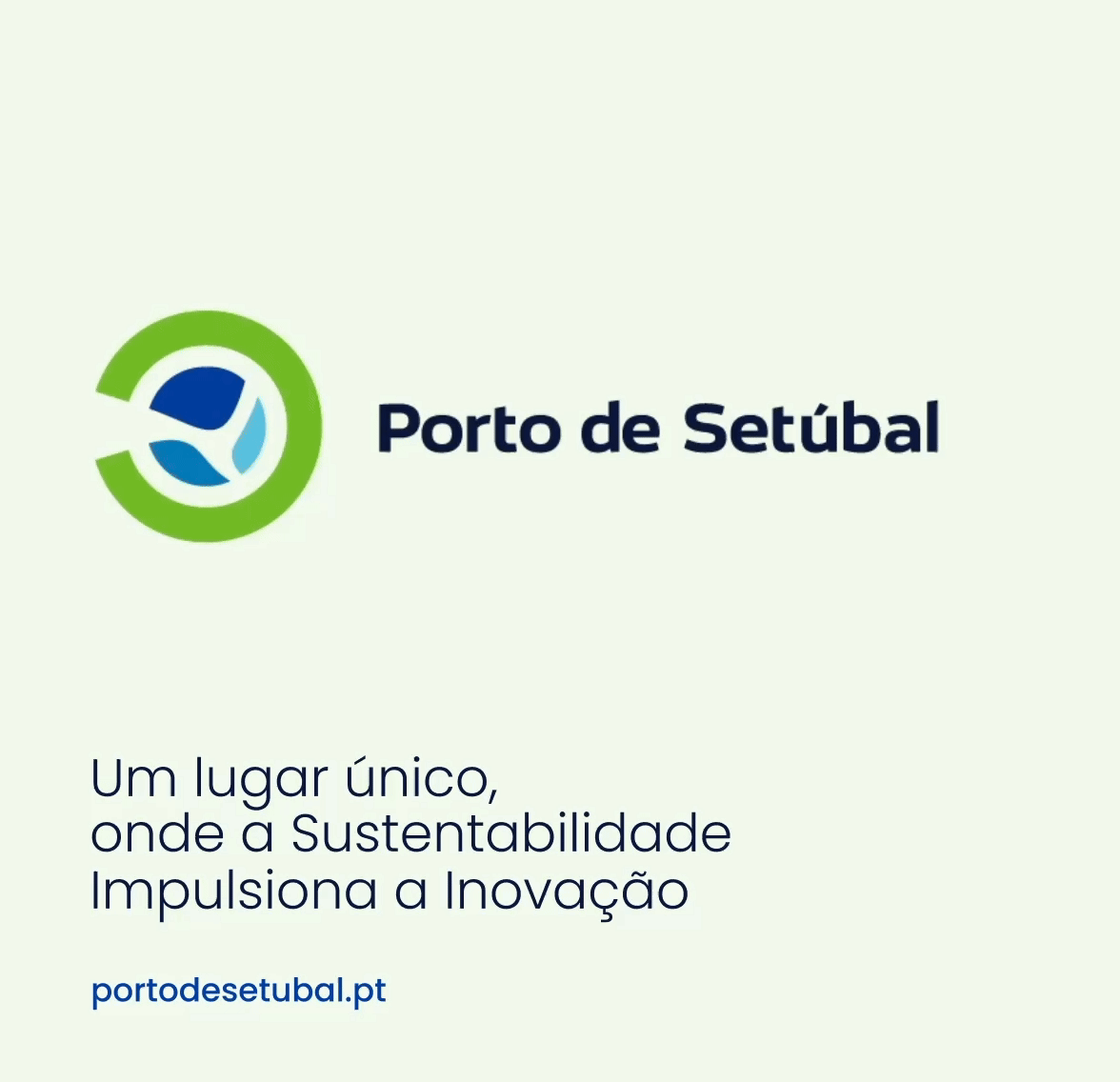
Port of Setúbal
In creating the identity for the Port of Setúbal, the uniqueness of the location was the starting point, with particular emphasis on the bay, recognized as one of the most beautiful in the world.
This insight inspired the development of a brand that celebrates not only the natural features of the region but also its commitment to sustainability and innovation. At the same time, the aim was to respect and deepen the relationship between the Port and the city, creating a brand that Setúbal's residents are proud of and see themselves reflected in.


Port of Lisbon
In the case of the Port of Lisbon, the solution centered on evolving the concept of "Connections," which already positioned the Port as a meeting point for people and businesses.
The goal was to project this idea into the future, positioning the Port of Lisbon as a transformative agent capable of driving positive changes in the sector and fostering the city's and the economy's development.


